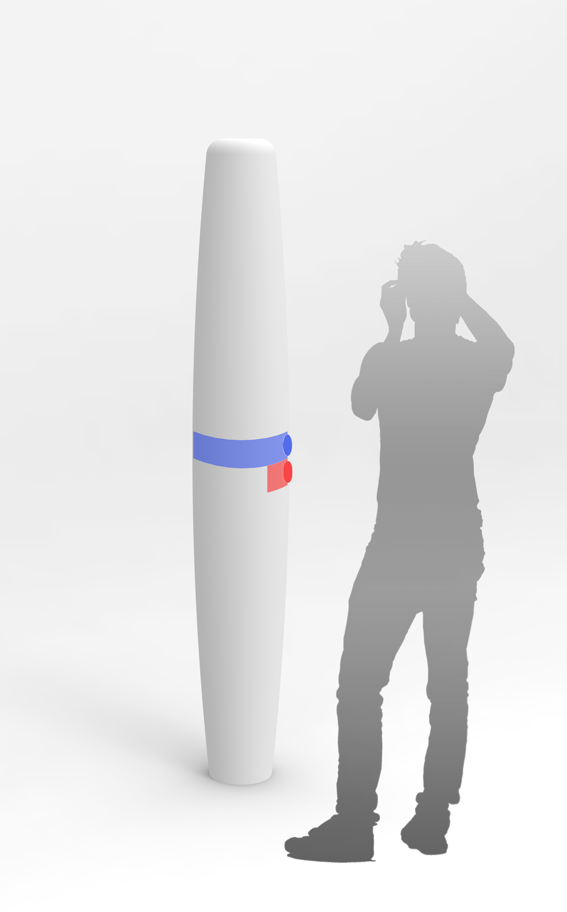
This project was conducted for NS, Nederlandse Spoorwegen, Dutch state-owned passenger railways operator. The project's brief was to redesign the Alarm and Information pole (NS pole) since the company identified some problems with its usability which negatively influence overall user experience of train station visitors and passengers.
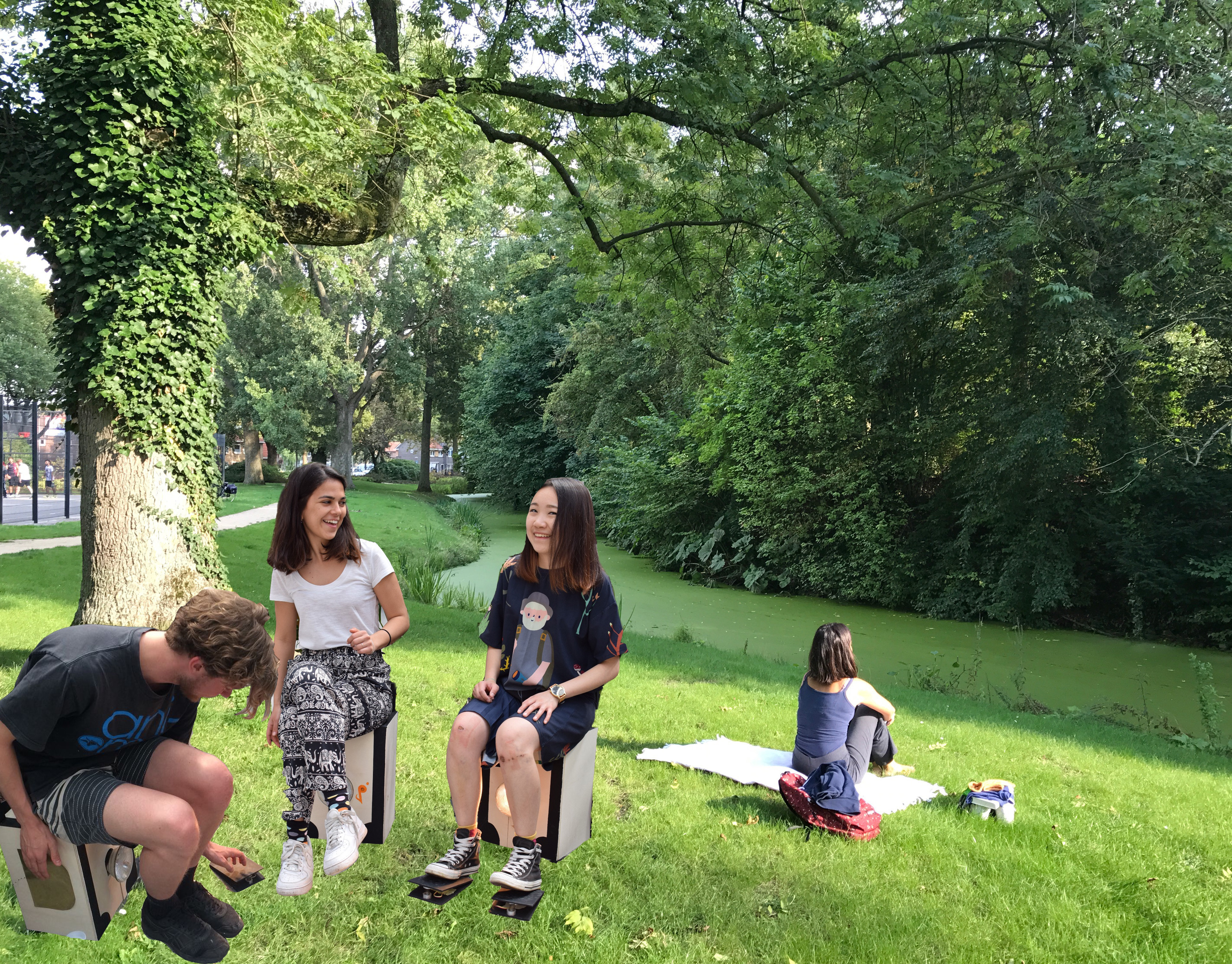
The project lasted for 20 weeks and completed with four other team members; Chenye Xu, Matthijs de Koning, Jelle-Jacop Kuiper and Wies Krundick working in weekly sprints. My contribution to the project was in the UX analysis, concept development and digital UX/UI designs.
1. Research
Product Analysis
Service touchpoints
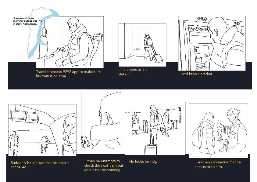
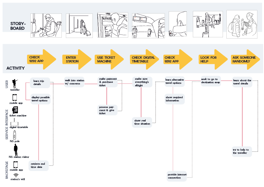
Storyboard of current situation
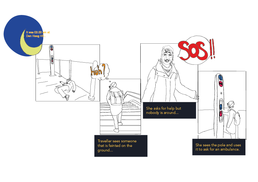
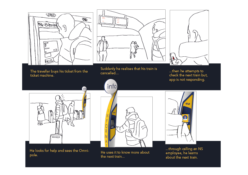
Intended use for SOS function
In the problem definition of NS, the lower number of usage of the pole and misunderstanding of sos and information functions are listed. In order to understand why these are happening, we conducted heuristics evaluation, observation and guerrilla interviews with station visitors. Findings of research suggested that the current pole was blending in the context due to its color and it wasn't attracting station visitors' from a distance nor closely; visitors weren't sure why to use the pole for (ie: what kind of questions to ask); furthermore pole's information and emergency functions were located too close to each other so that it becomes harder to distinguish "where to press when" especially with commuting mindset. In order to identify these issues we formulated our research question as how can we improve visibility and usability of the pole? Furthermore, at the end of this phase we define our design qualities which later will become subjective measure metrics in usability testing.
1.2 Concept Development & Testing
Help yourself: digital guide
Extensive offline guidance
New generation pole
We came up with 3 design concepts which provide different ways of information retrieval, visibility and overall user experience. With the concepts we also targeted our pre-defined design qualities such as personal, self-efficient, supportive and efficient. It's important to mention here that with these concepts, we aim to test design attributes of each concept that relate to our design qualities and explore further effects.
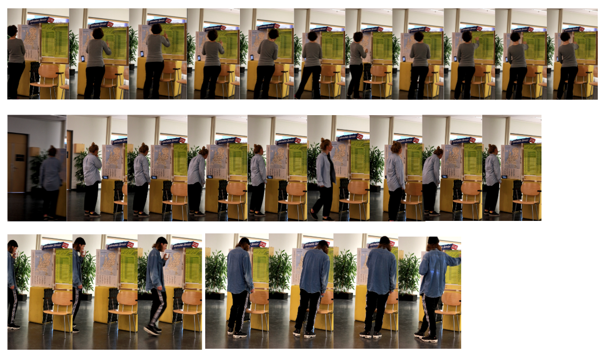
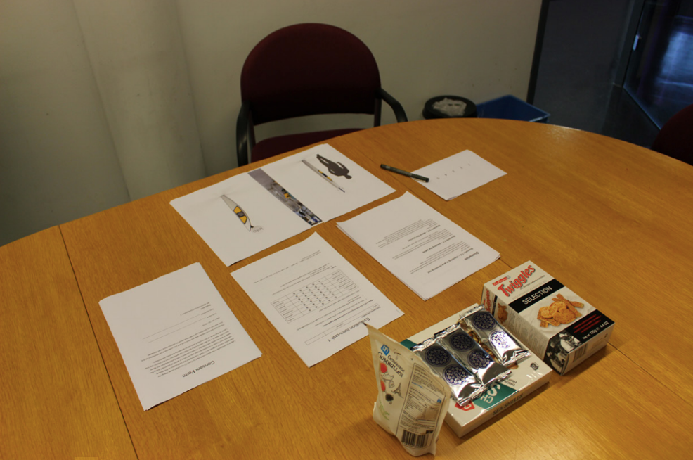
In order to test different qualities that would improve visibility and eliminate misunderstanding of two buttons; we conducted concept testings by using experimental prototypes with 12 participants who are (1) frequent travellers (ie: everyday commuters) and (2) new comer station visitors (ie: tourists). We applied cognitive walkthrough based on task completion following think aloud procedures. The sessions were concluded with interviews to generate qualitative insights. Afterwards, we categorised these insights based on visibility, usability (distinguishable, clarity, personal etc) and design attributes (big space, pop-up sign etc).
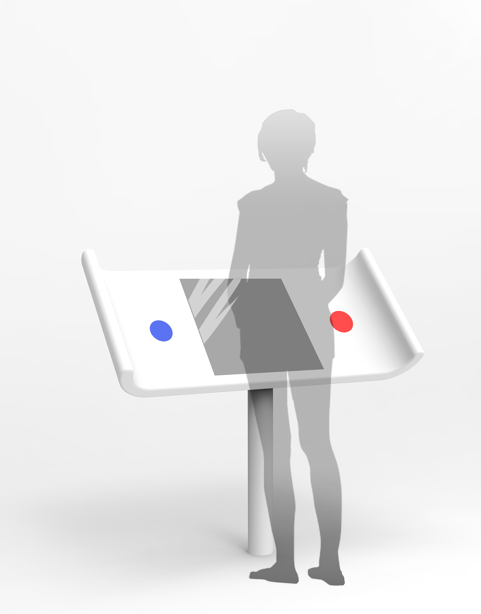
2. Design
Front view
Close-up view
Side view
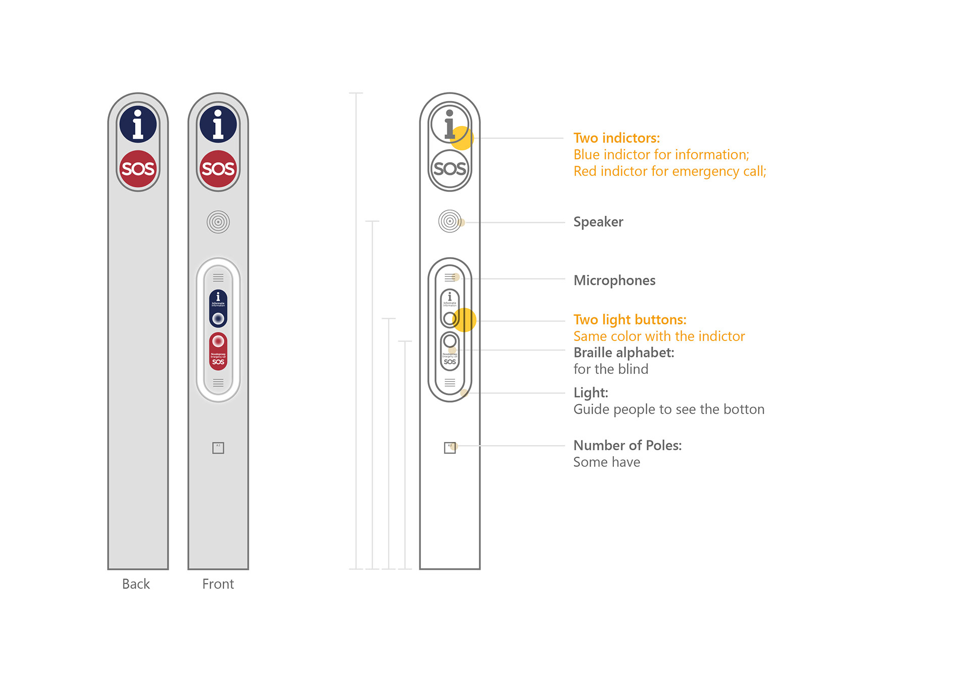
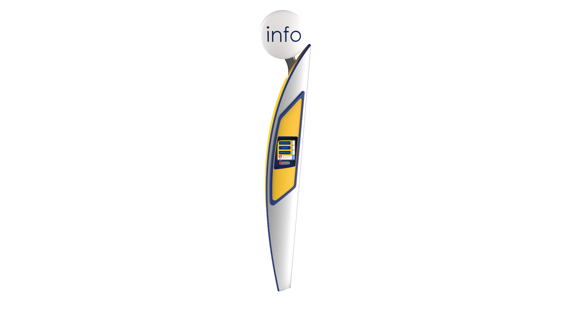
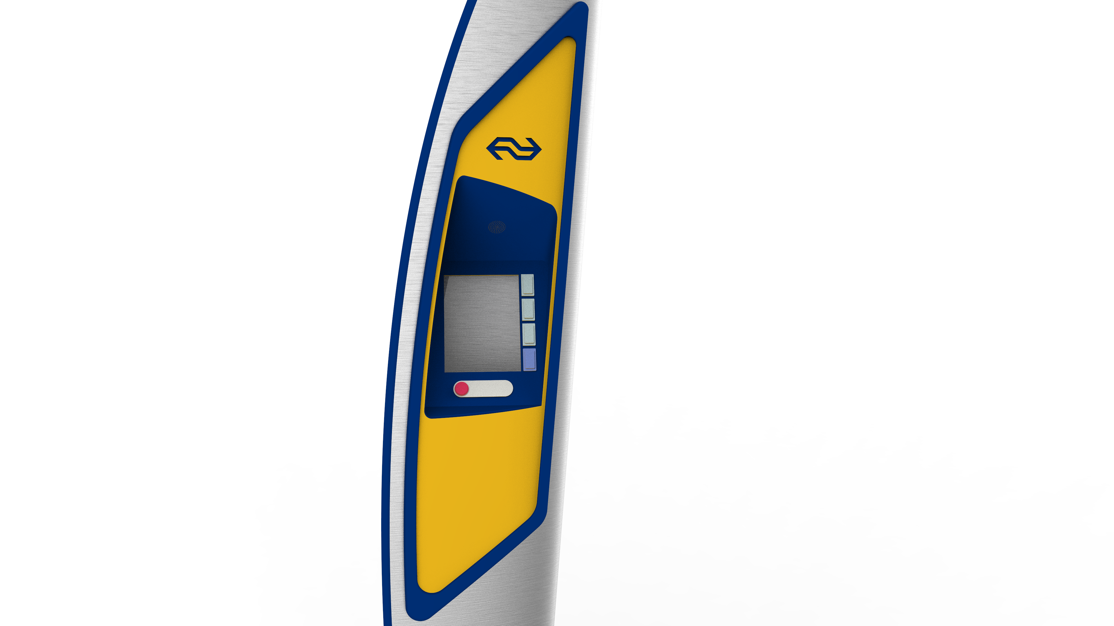
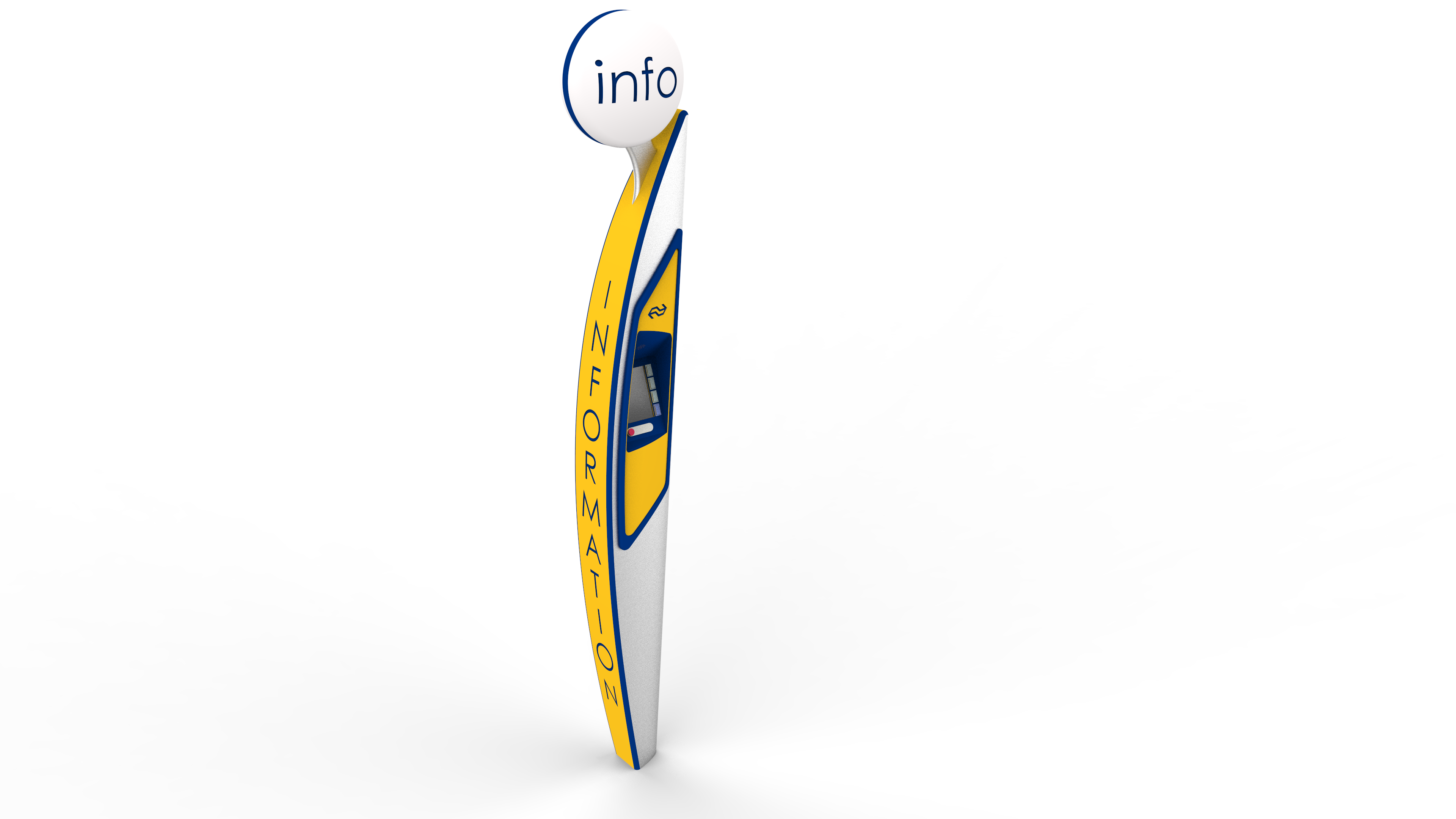
Redesign of the NS pole had a look that is easy to distinguish from a distance with it's "info" bubble that pops out from the upper right corner of the pole. Furthermore, the big "information" text that is written on its side, makes the pole visible from every corner. The reason that we decided to push forward the information function of the pole is that during the concept testing sessions, we realise that people use the pole for retrieving information more when compared to sos function. By keeping sos button on the pole, we aimed that sos function can be something that is learned with time by the usage of the information function. Passengers would be able to reach out sos function the time they need since they would know where it stands.
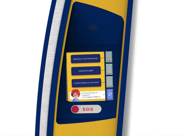
With a manual screen, passengers are guided to retrieve information depending on difficulties they face while they are in the station. Through adding an avatar of NS employee, we aimed to create personal connection of passengers with NS. Calling function stayed as a part of the screen whereas SOS button is located under the screen which separates these two confusing functions.
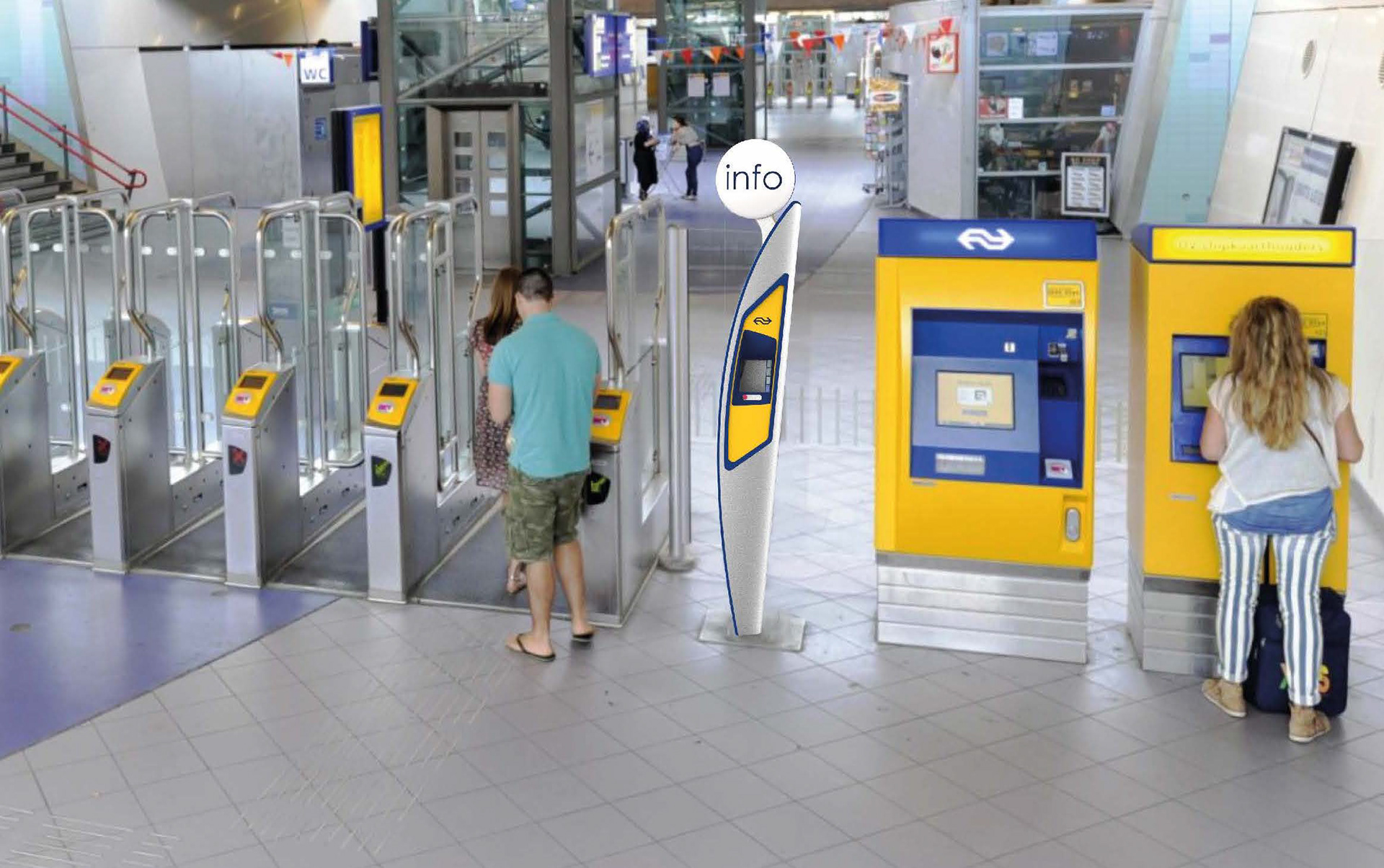
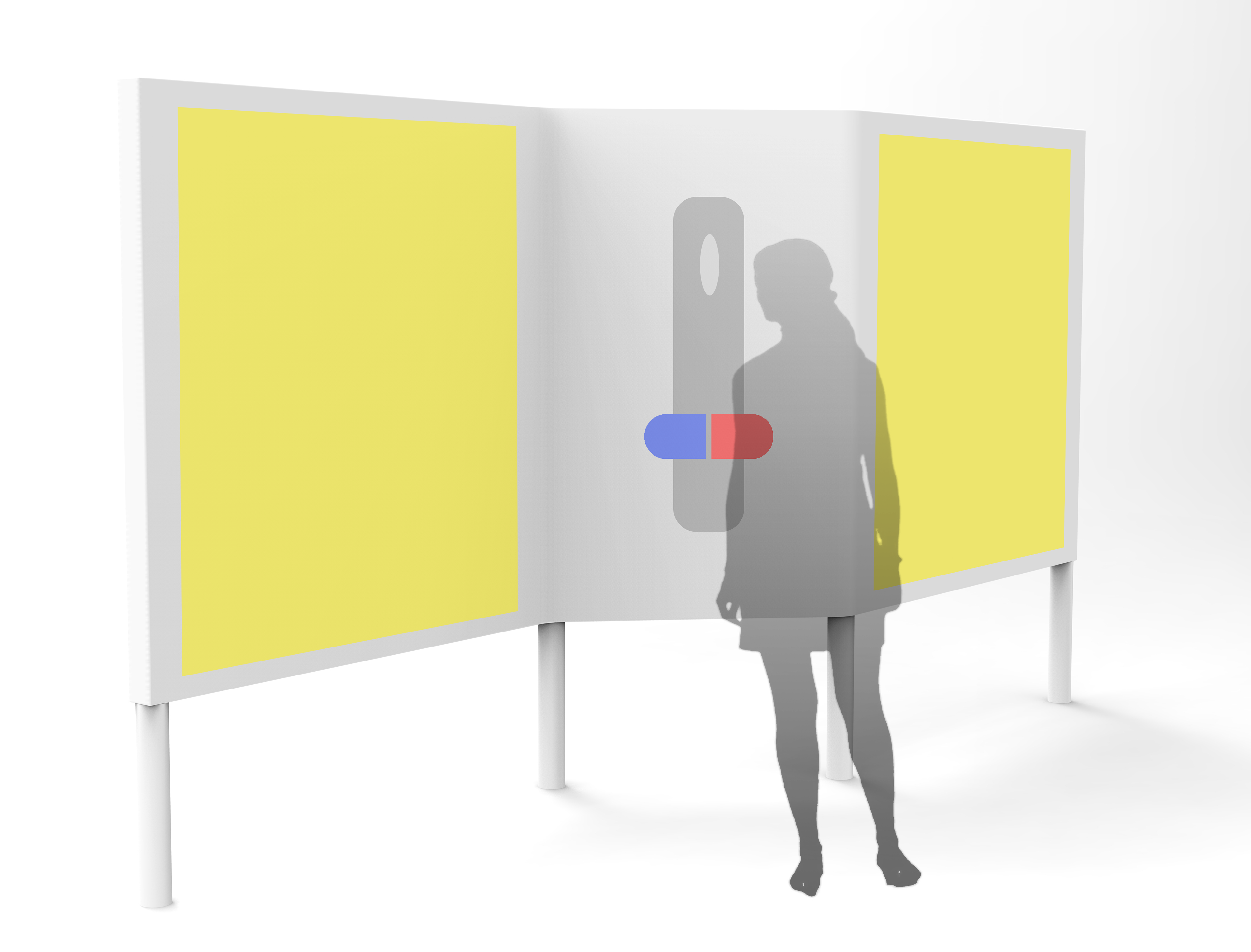
Redesigned pole is in the context of stations
Use scenario with the new pole
3. Usability Testing
Test setup: Interviews
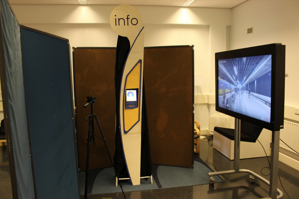
Test setup: Usability test
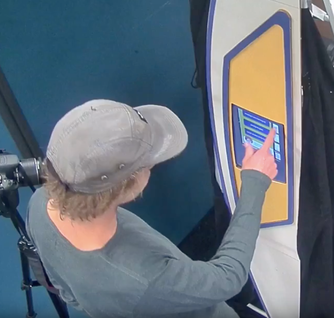
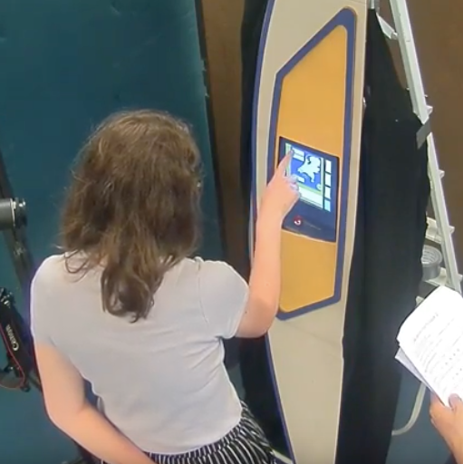
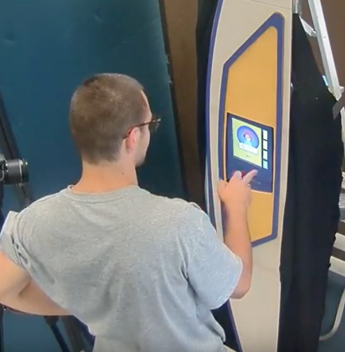
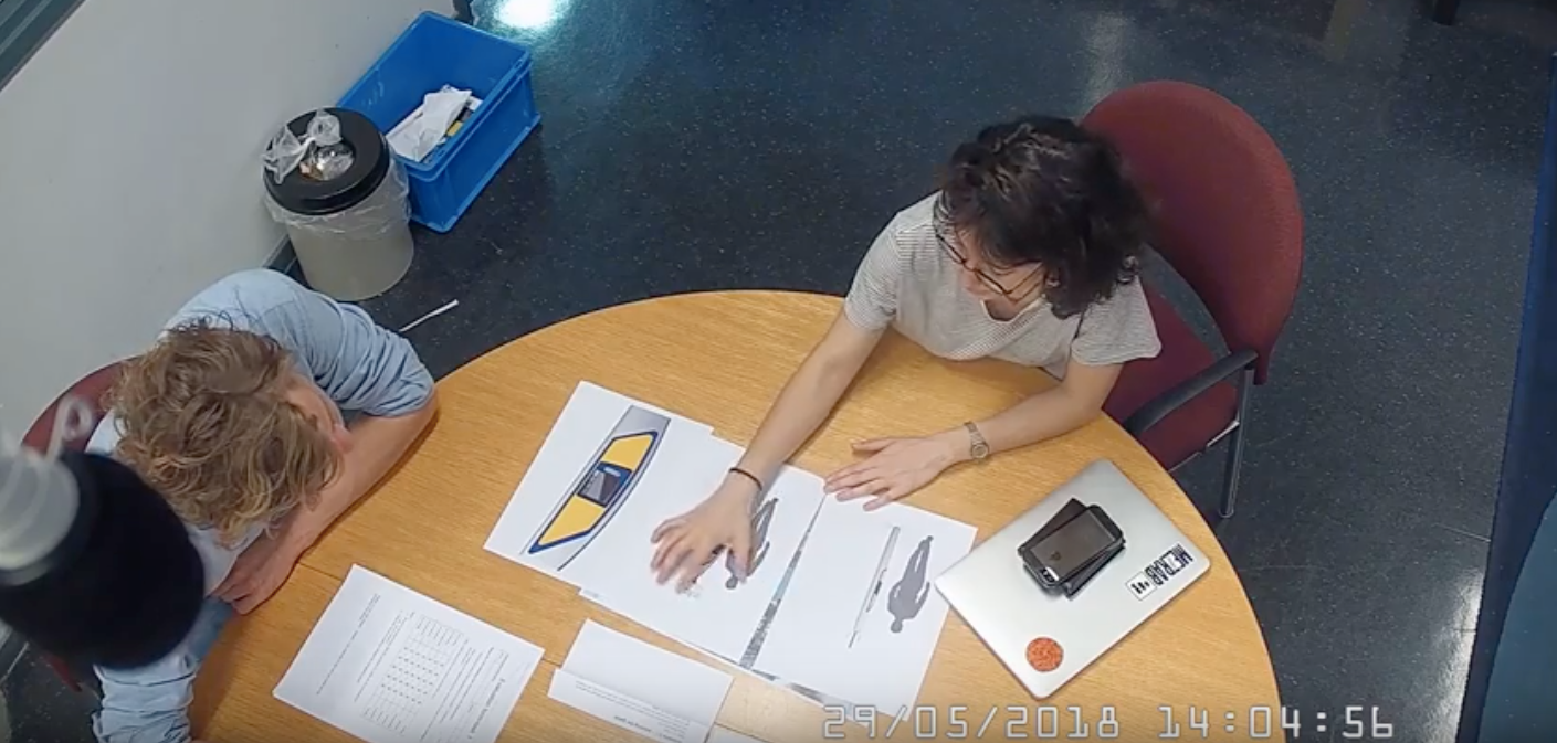
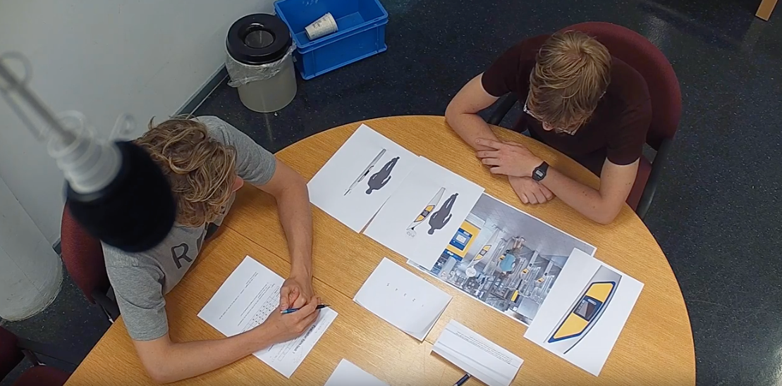
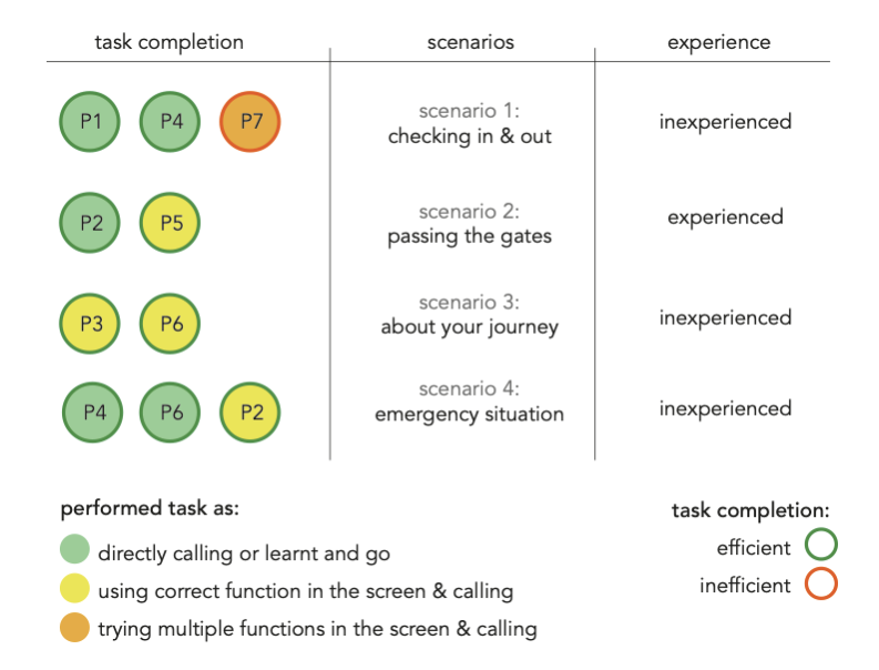
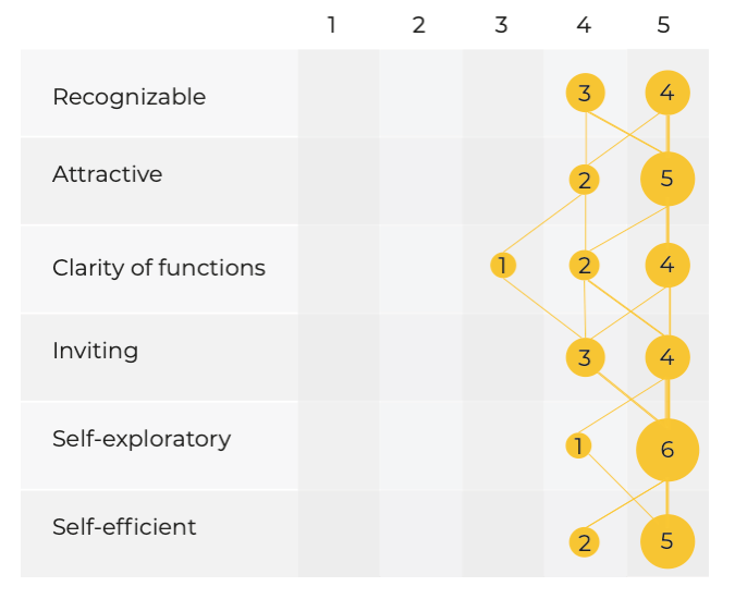
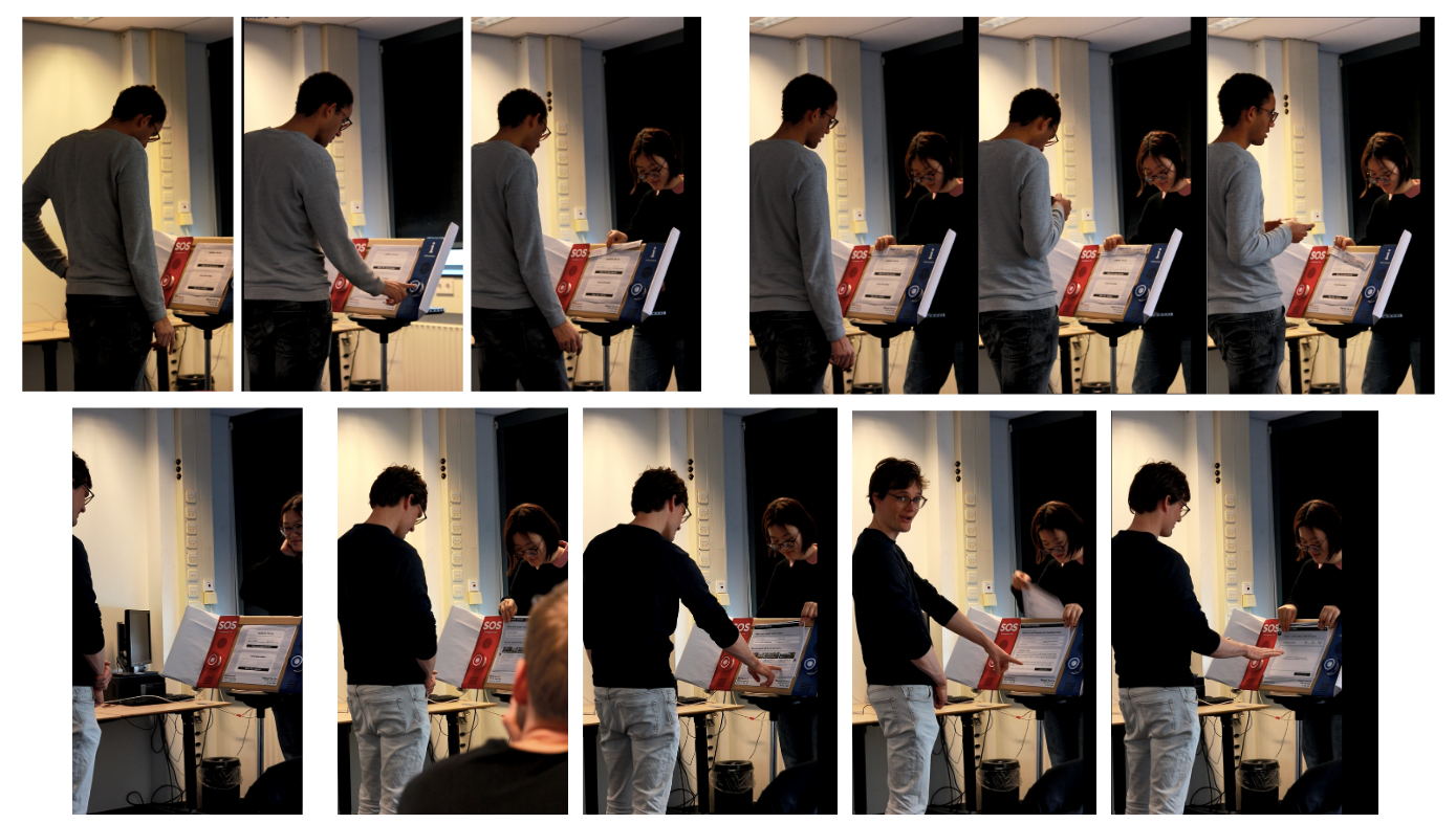
To test our new design, we conducted lab sessions with 7 participants. Cognitive walkthrough based on task completion is conducted followed with an interview & survey.
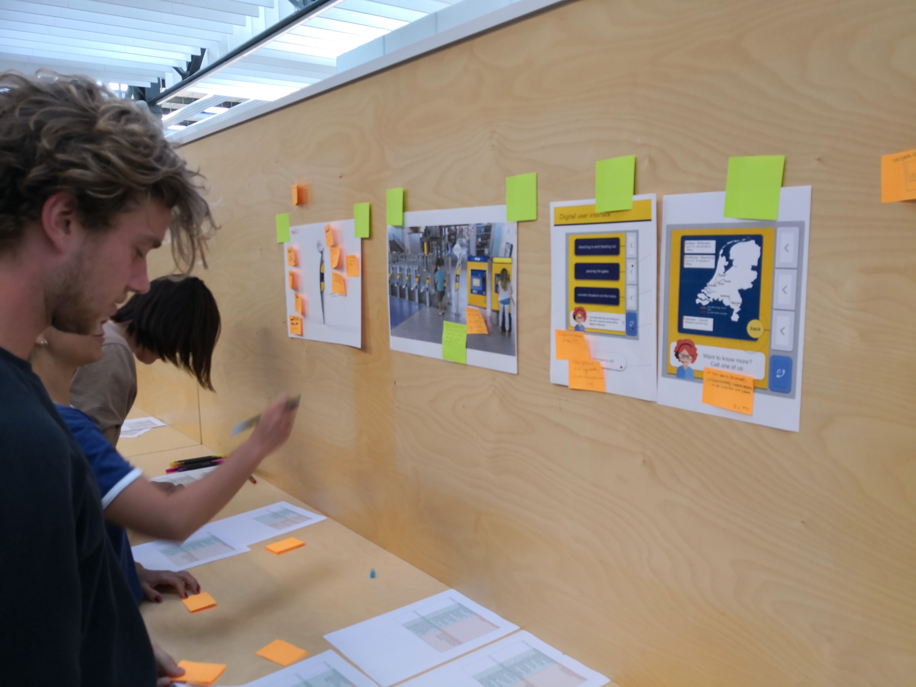
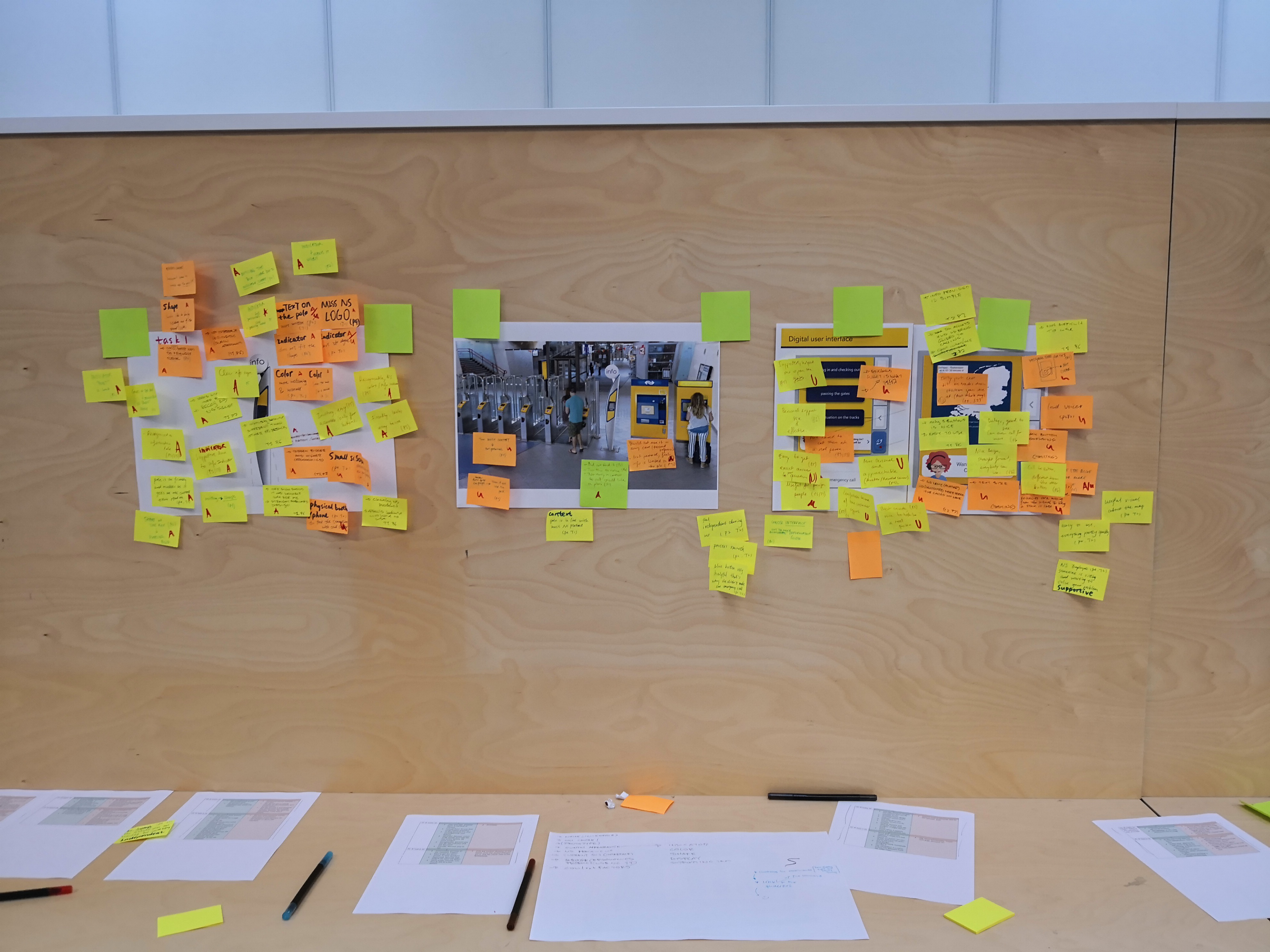
Qualitative analysis of data
The analysis are conducted on the walls, by creating an affinity diagram. Here, we took qualitative insights generated from think aloud's of participants as well as interview results. Furthermore, survey results provided quantitative data support to justify our design in relation to our design qualities.